 |
| …Friends? |
I have to admit that I know so little about Hollow Knight. But aren’t these two characters drawn and painted so well?
My eyes keep going back to what the two are sitting on. They appear to be something like pill bugs or something that tiny. Their source of light is also fun, maybe they broke up some creature’s egg and the little gnats inside it provide the light, while the two have a long awaited rest. Even if they won’t be friends for long…
 |
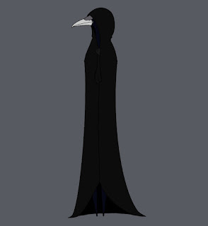
| Azure |
A crow in a cloak…one who is often mis-gendered, as I was told when I made the same mistake. Poor boy!
He looks kinda like one of those crows that we would see designed on a pyramid or something in that area. He also seems like he may fit well in a Hollow Knight story, too. This piece gives me so many ideas to play with in my mind, it’s an excellent character design!
 |
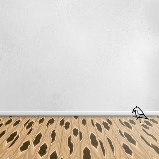
| Even the backgrounds take work |
This is the one that drew me to FrozenCrow’s work. Can you see the detail in the wall? It had to have taken an age by itself and I just love that floor design. Don’t forget that shadow under the wall, it’s placed perfectly!
Could see this as a room that’s just waiting to be moved into. There are so many ideas that can work for it–a cute little dining room; maybe a reading area? Whatever is put here, make sure the bird likes the idea. It clearly lives in this little area so make this space comfortable!
These pieces were all so fun to see and imagine scenes and ideas about! If you’d like to see more of her work, here is HeartOfTheFrozenCrow’s gallery!
