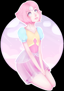
I really do enjoy how LilPinkDemon handled all of her colors in this! The very pale pink/purple in the background does wonders to help push Pearl forward. And isn’t it something how she managed to make everything shine in just the right ways in the foreground? That was just another trick to make the figure come forward and I love it.
Unfortunately, I don’t know if Pearl was supposed to be on a transparent background or if it was meant to be black! For some reason, dA’s transparencies aren’t always working–I’d claim it to be the new Eclipse changing up the code? Then again, look how well that white around the character is looking. It wouldn’t surprise me if that black was meant to be here, as well as in the last piece I’m featuring today.
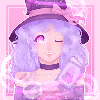
The design in the Witch’s eye is entrancing, to me at least. Maybe that’s the point! She could be casting a charm or something…and by LilPinkDemon’s own words, the potion and maybe the cards are used for love spells.
Enough about the story I see in this. LilPinkDemon has again used her colors so well to show the character coming forward. And as pale as some of the colors are, there’s no real difficulty to see anything in the scene (to me, at least). I’d love to have such a mastery of it all! XD
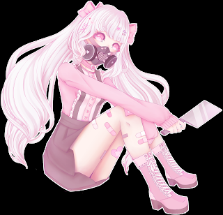
This character belongs to someone else as part of an art trade and it’s so interesting how well she made the pinks work for such a dangerous-looking character. Also, look at how natural the posing looks. It’s like she (the character) was just waiting for someone to take a photo.
Even with the threat level right there, it’s just a completely cute piece! Just someone you wouldn’t necessarily expect to be sneaking around with things like that. …I wish I knew the story. XD
LilPinkDemon’s gallery is right here; head there if y’all enjoyed the work in this feature like I did! And don’t forget to check the folders above the artwork to see more than the 24 that she featured in her own gallery. ^^


