 |
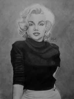
| Marilyn Monroe |
I’m not only impressed with how Mochitila drew this piece. Look at her great command of light and shadow–like how that black top is not lost on the shaded gray behind the whole piece. And about that gray; it does a super job to set off the skin color and especially that hair. What do you think about how well she drew the face and head, while we’re at it? I personally love how Mochitila captured the way Marilyn was looking into the camera.
Excellent job!
 |
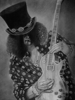
| Slash 2 |
Mochitila has a few references that she used for this piece listed in her artist’s comments. Didn’t she draw them just right? And she’s so lucky that she was able to see the band like she mentioned. Being able to see this guy in person had to be amazing.
Fangirling aside, what do you think about that shirt he’s wearing? It looks like it was so very comfortable, the way that she drew it. But, even more interesting, look at his hands working that guitar over. Those hands look amazingly realistic–yes the rest of him is great but the hands just jump out to me since they’re so difficult to make look right!
 |
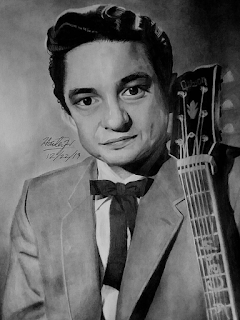
| Johnny Cash |
This piece only took her three hours to bring together too. A very well used time, in my opinion!
This was such a fun bit of art to feature this time around and I have such a respect for people who can control a pencil the way she has! If you’re interested in seeing more of mochitila’s work, have a link to her gallery!
