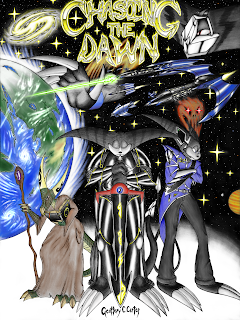
First off, this is the cover of a recently finished book. Can’t wait for the story to be brought public, honestly. These three characters look pretty interesting and I’d like to learn what everyone is like.
The planet on the left is drawn super well, in my opinion. And he actually remembered the way the atmosphere would look around said planet! And the way he drew the space ships make them look very sleek. LOVE this work!
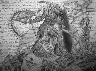
The shading done here was done super well. I love how strong that shield looks and how dangerous the ground Firesword is walking on appears. But can we just turn our focus to that weapon in his hand? I would hate to have it coming toward me in a battle! And it wouldn’t surprise me if it could do more than crush a creature’s center!
Other than this image having such an exciting set up, he has shared a bit of a chapter in the book that was mentioned before. You’ll do yourself a great service if you read up!
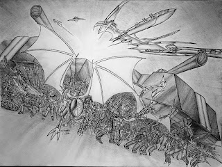
About the picture: I love how busy everything seems as if they’re rushing toward the next battle in front of them. And let’s focus on not only the tank on the right, but that dragon-armored soldier leading the charge! It’s so busy and I love it! Excellent work.
After seeing these three, you want to see what other amazing pieces GeofferyCCarter creates, right? Here is the link to his gallery. Hope that you stick around there for a while!


